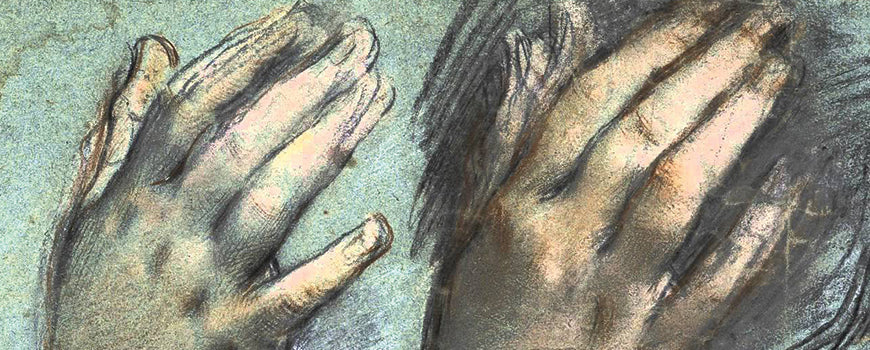
This gorgeous preliminary study by Federico Barocci allows the viewer a rare glimpse inside the creative process of a renowned master who lived and worked centuries ago.
Charcoal and graphite can produce some interesting results with the combination of the matte of charcoal and the gloss of graphite. Together, the matte and glossy look creates a unique drawing that can sometimes look different depending on the angle its viewed from. Charcoal and graphite each have their own characteristics and reflect light differently.
Understanding how to shade properly helps us to offer a more three-dimensional look in our art. Values, or tones are just varying shades of grey and using a variety of different values is where you begin when you start shading.
Figure drawing class, properly run, should feel welcoming and inclusive, warm, safe, and subdued: a sanctuary of peace, quiet, and unpressured concentration.
Virtually all public spaces conducive to drawing from life remained off-limits to unchaperoned women of the upper class, who alone possessed sufficient wealth and leisure to allow for artistic pursuits.
One of the biggest questions that any teacher or artist working with charcoal gets from those just starting out is, “What sort of paper should I use with charcoal drawing?” The answers are as varied as the artists that are being asked.
 This gorgeous preliminary study by Federico Barocci allows the viewer a rare glimpse inside the creative process of a renowned master who lived and worked centuries ago.
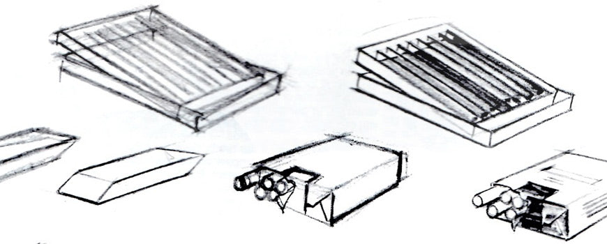 Refine initial cubes and objects using two stages to perfect perspective in charcoal drawing.
 Charcoal and graphite can produce some interesting results with the combination of the matte of charcoal and the gloss of graphite. Together, the matte and glossy look creates a unique drawing that can sometimes look different depending on the angle its viewed from. Charcoal and graphite each have their own characteristics and reflect light differently.
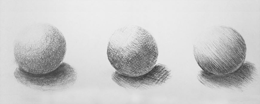 Understanding how to shade properly helps us to offer a more three-dimensional look in our art. Values, or tones are just varying shades of grey and using a variety of different values is where you begin when you start shading.
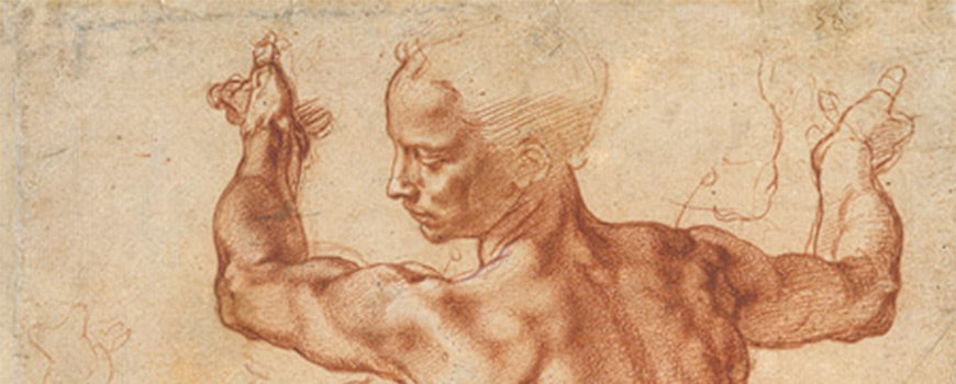 Figure drawing class, properly run, should feel welcoming and inclusive, warm, safe, and subdued: a sanctuary of peace, quiet, and unpressured concentration.
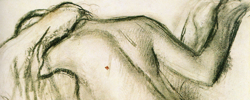 Virtually all public spaces conducive to drawing from life remained off-limits to unchaperoned women of the upper class, who alone possessed sufficient wealth and leisure to allow for artistic pursuits.
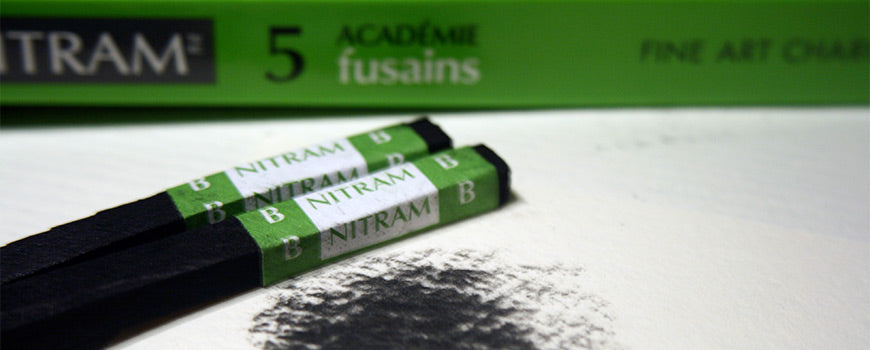 Find out how to get the most from soft charcoal - whether covering a large area or building tonal value.
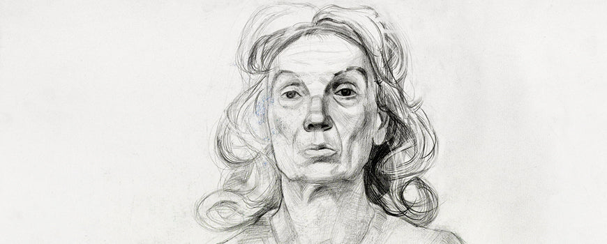 Finding the ideal subject matter for your latest drawing or painting can be difficult. Discover how to find inspiration in any environment.
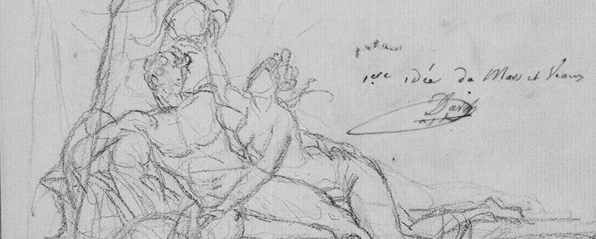 Why is life drawing viewed as the requirement, the inarguable prerequisite and foundation for all other forms of artistic expression?
 I recently had an interesting conversation with an American artist friend via e-mails through translation by my daughter Iris. The conversation rev...
 Lighting is one of the most important factors when setting up a home studio - learn how you can turn a home studio into something more.


